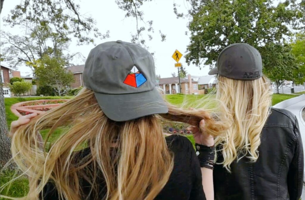
We here at A.P.E.X. subsidiaries are always learning, and like to treat life as a puzzle that is capable of being solved. Naturally, we’ve taken a lot of consideration in order to capture that concept in our logo, which is why every detail has been thoroughly thought out.
We started with the shape of a pyramid, because very few shapes can inspire wonder and mystery the way pyramids have.

We then cut out a section of it in order to denote how our understanding of them is incomplete, and that we still have much to learn from the megalithic structures.
The upper portion now becomes a floating pyramid that represents A.P.E.X. subsidiaries, while the lower portion is broken down into four colored sections that represent the subsidized portions that we created through our think tank. ![]()
We think of this as the perfect metaphor for bringing ideas to life. The top pyramid being the prism of the mind, or the “receiver of consciousness”. While the bottom portion is our reality, which is influenced (and even created) by that prism.
The colors weren’t arbitrarily chosen or positioned either. They are the same colors, in the exact same configuration as a Rubik’s cube. Further exemplifying how life is like a puzzle that needs solving.

*Note: The only color you can’t see is yellow, which is underneath the pyramid and only visible in a 3-D rendering of our logo